
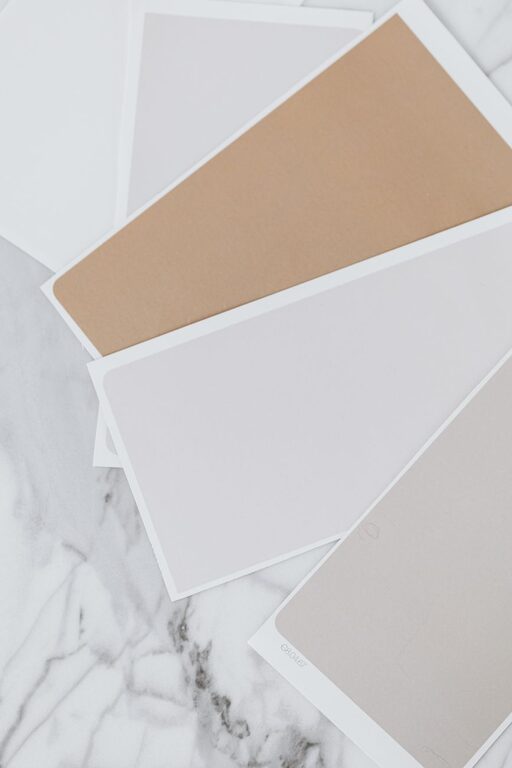
Creating a serene and comfortable atmosphere in your home starts with the colors you choose for your walls and décor. Calm colors have the power to soothe the mind, reduce stress, and make your living spaces feel more inviting. If you’re planning to refresh your home’s look or simply want to create a more peaceful environment, picking the right calm colors is essential.
In this post, we’ll explore practical tips for choosing calm colors that fit your home’s style and help you enjoy a relaxed, harmonious space.
Why Choose Calm Colors?
Calm colors typically include soft, muted tones such as light blues, gentle greens, warm grays, and neutral shades. These colors don’t overwhelm the senses and can promote feelings of relaxation and well-being. They are especially beneficial in rooms where you unwind, like bedrooms, living rooms, and bathrooms.
Using calm colors wisely can help:
– Reduce feelings of anxiety and stress
– Create a sense of balance and harmony
– Make rooms feel more spacious and airy
– Enhance natural light and brighten dark spaces
Tips for Choosing Calm Colors
1. Consider the Mood You Want to Create
Think about how you want to feel in the space. For example:
– Peaceful and restful: Soft blues and pale greens work well. These colors mimic nature and promote tranquility.
– Warm and cozy: Light beige or warm gray tones can add a comforting and inviting vibe.
– Clean and fresh: Whites and very light pastels create an airy, refreshing atmosphere.
2. Use a Color Palette with Soft Tones
When shopping for paint or selecting fabrics, look for colors that are muted and less saturated. Bright or intense colors tend to energize the room instead of calming it.
Some calming color choices include:
– Light blue
– Sage green
– Lavender
– Soft beige
– Pale gray
– Dusty rose
3. Test Colors in Different Lighting
Lighting can change the appearance of a color significantly. Always test paint samples on your walls and observe them at different times of day. Natural sunlight, as well as artificial lights, can influence how calm or vibrant a color feels.
4. Pair Calm Colors with Natural Elements
Incorporate natural materials like wood, stone, or plants to enhance the soothing effect of calm colors. These textures add warmth and depth without overwhelming the senses.
For example:
– Light wood floors complement soft green or beige walls
– Stone accents enhance gray or blue tones
– Indoor plants bring life and balance to pastel rooms
5. Balance Cool and Warm Tones
While cool colors like blues and greens are traditionally calming, adding a hint of warmth can prevent the room from feeling too cold or sterile. Pair cool colors with warm neutrals or soft metallic accents to create a balanced feel.
6. Mix Different Shades for Depth
Using multiple shades of the same color or combining complementary calm colors adds visual interest without disrupting the peaceful vibe.
For instance:
– Pair a pale blue wall with navy blue cushions
– Use a mix of soft gray tones with cream furniture
– Combine muted lavender with soft blush accents
7. Keep Bold Colors to a Minimum
If you love bold colors, use them as accents rather than the main color. A splash of rich color on throw pillows, art, or a single accent wall can energize the space without overwhelming the calm foundation.
Practical Room-by-Room Color Suggestions
Bedroom
Choose colors that promote relaxation and sleep, such as soft blue, pale lavender, or creamy beige. Keep the palette simple, focusing on shades that help the mind rest.
Living Room
Since this room is often used for socializing and unwinding, opt for balanced tones like warm gray, muted green, or soft taupe. Adding natural textures and layering soft fabrics can boost comfort.
Bathroom
Light, refreshing colors like pale aqua, seafoam green, or crisp white create a spa-like atmosphere. Consider materials with a natural finish to enhance serenity.
Home Office
To improve focus and reduce stress, use calming greens or light blues. Avoid overly bright colors that may cause distraction.
Final Thoughts
Choosing calm colors for your home is a wonderful way to create a peaceful oasis that feels welcoming every day. Focus on soft, muted shades, test colors under different lighting conditions, and use natural materials to boost the soothing effect. Remember, calm doesn’t mean boring — with a thoughtful palette, your home can be both relaxing and stylish.
Take your time selecting colors, and enjoy the process of making your home a tranquil retreat.